I’ve been touting Version 2 of the property management module for almost 6 weeks now. However, there are quite a few features and changes that will affect ALL users. One of those enhancements is the navigation menu.
PLEASE take note:
1) The dashboard menu item has been integrated with the Lodgix.com logo, which now says “Lodgix.com Dashboard”, this will save space and make the menu more presentable on tablet devices.
2) The Reports menu item has been removed and changed to an icon only in the upper right corner
3) There is a new Work Orders menu item
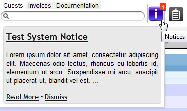
4) The alerting and system messages system has been replaced. There are two new icons for alerts and work orders which will alert you when new notices and work orders are present. Onmouseover, the notices will drop down allowing you to read the notice without cluttering up your screen as the previous system did.


