Say Hello to the New Lodgix Booking Experience
Today we’re thrilled to roll out a completely redesigned online booking and checkout page at Lodgix.com — the page your guests see when they’re ready to reserve. It’s cleaner, calmer, and built from the ground up to turn lookers into bookers. Every change we made answers a single question: how do we make it as effortless as possible for a guest to say “yes”?
Here’s a look at what’s new and why it matters for you and the guests booking your properties.

A guided, step-by-step checkout
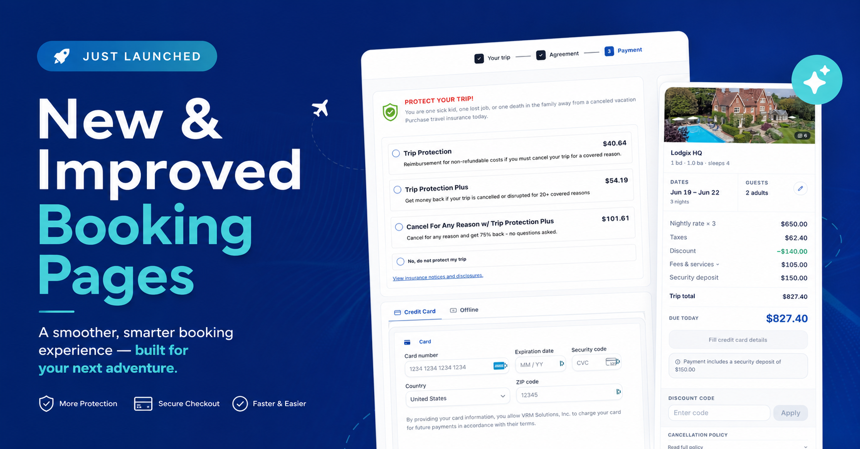
Gone is the single overwhelming wall of fields. The new checkout breaks the booking into three clear, numbered steps — Your Trip → Agreement → Payment — with a progress bar across the top so guests always know exactly where they are and how much is left.
Why does that matter? A multi-step flow reduces the cognitive load at each stage. Instead of staring at one giant form, the guest focuses on one manageable task at a time. That sense of steady progress is a proven way to keep people moving toward the finish line, which means more completed bookings and fewer abandoned carts.
We’ve also added a friendly safety net: if a guest steps away mid-booking, a “Welcome back — pick up where you left off” prompt lets them resume right where they stopped. No re-typing, no frustration.
A cleaner, calmer design
The look and feel got a top-to-bottom refresh, and the difference is immediately obvious.
- Rounded corners everywhere. Softened edges on every card, field, and button give the page a modern, approachable feel. Sharp corners read as dated and rigid; rounded ones feel friendly and trustworthy — exactly the impression you want at the moment someone is handing over a credit card.
- Generous white space. We gave every element room to breathe. Open space isn’t wasted space — it guides the eye, separates each section cleanly, and makes the whole page feel uncluttered and easy to scan. Less visual noise means less hesitation.
- A summary that follows the guest. The booking summary card — property photo, dates, guest count, the full price breakdown, and a crystal-clear “Due Today” figure — stays pinned beside the form through every step. Guests can confirm exactly what they’re paying for without scrolling back, and can edit their dates or guest count right from that card.

Travel insurance, right where it belongs
One of the most exciting additions: travel insurance is now offered directly inside the booking path. On the Payment step, guests can choose from clearly explained coverage tiers — Trip Protection, Trip Protection Plus, and Cancel For Any Reason — each with a plain-English description and an up-front price.
This is a win for everyone. Guests get genuine peace of mind at the exact moment they’re thinking about their trip, instead of stumbling across a confusing offer somewhere else (or nowhere at all). And because the option lives inside the natural checkout flow — with a clear “No, do not protect my trip” opt-out and visible insurance disclosures — it’s helpful rather than pushy. For property managers, it’s an effortless way to add protection your guests value, fully integrated into the booking they’re already completing.
The little touches that add up
Plenty of thoughtful details round out the experience:
- Optional extras — firewood, towel service, and any custom add-ons — are presented as simple one-tap “Add” buttons, making upsells frictionless.
- A discount code field sits neatly in the summary, with the applied savings shown in green so guests can see the value they’re getting.
- Transparent pricing spells out the nightly rate, taxes, fees, discounts, and security deposit, with a note clarifying when a deposit is included in the amount due today.
- Smart field touches like an auto-detected country flag on the phone input and autofill-ready address fields make form entry faster on any device.
- Multiple ways to pay — credit card or offline — with an optional “save my information for faster checkout” for repeat guests.
Available now
The redesigned booking and checkout experience is live today for Lodgix properties. There’s nothing you need to do — your guests will simply enjoy a smoother, more professional path to booking, and you’ll benefit from the higher conversions and new revenue opportunities that come with it.
We can’t wait for you to see it in action. As always, we’d love your feedback as your guests start booking on the new page.