Two weeks ago we soft launched our new online booking pages. Over the past couple of weeks we’ve been adding back features, tweaking the layout, fixing bugs, etc. The new design and code represent a massive step forward as the booking process is MUCH simpler, deploys a MUCH better user interface and works spectacular on all mobile devices. We are already seeing a 20-30% increase in online bookings since the new pages launched.
The booking page is a five step process:
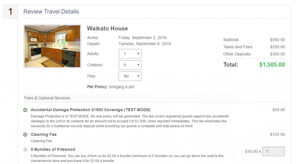
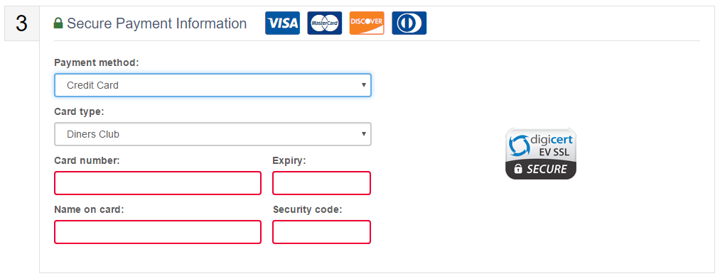
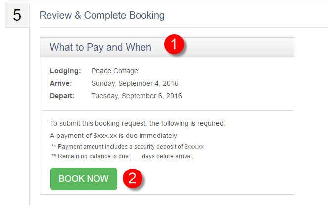
The form alerts guests if any fields have been missed and also features some handy formatting components which make it super easy to enter phone numbers, credit card data, etc..
Step 4 of the current booking process displays your cancellation and deposit policies, as well as additional information about the damage protection products (if offered). This will be replaced very soon by a mobile friendly version of your rental agreement. Guests will easily be able to read and (for users of the digital signature module) sign the guest rental agreement BEFORE completing the booking.
In the current implementation the rental agreement is displayed after the booking is complete. As mentioned above, soon the rental agreement will be moved within the the booking page itself. The old digital signing process was not mobile friendly so we weren’t comfortable inserting it into the booking page. The new process will be mobile friendly and should not impede the online booking in anyway.
Once the booking is complete, guests are taken to a post purchase page where the guest can view additional next steps instructions, as well as be given the (optional) opportunity to purchase travel insurance.
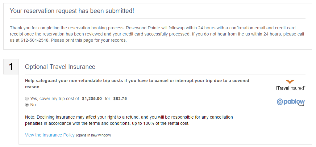 The text at the top can be set within Lodgix at settings > online booking text.

And finally a guest invoice number is displayed, as well as PM contact information and offer a print friendly icon for the guest to print the booking request for their records.
Customization Options
Within settings > online booking theme, within Lodgix, there is a new box for the more advanced users to enter CSS to customize the look and feel of the page. While this option offers much more flexibility than our previous booking pages, we will be rolling out more options in the coming weeks which will allow the use of company logos, the choice of several premade templates, etc..
The objective is to give the user the ability to match the look and feel of their booking pages to that of their website. Previously this was not possible.


